This data source was chosen because it offers valuable insights into stock market performance. By analyzing price fluctuations, we can determine how the demand for certain companies compares against others.
Looking at Stock Prices of Automotive Companies:
Please toggle the code for further details and in line comments for how the data is gathered
Show the code
# Load necessary librarieslibrary(quantmod) # For financial market datalibrary(plotly) # For interactive plotting# Set options to suppress warnings related to getSymbols functionoptions("getSymbols.warning4.0"=FALSE)options("getSymbols.yahoo.warning"=FALSE)# Define stock ticker symbols for various automotive companiestickers = c("STLA","GM", "TM","NSANY", "MBGYY", "BMWYY","POAHY", "TSLA" )# Retrieve historical stock data for the tickers from Yahoo FinancegetSymbols(tickers, auto.assign = TRUE, src="yahoo")# Loop through each ticker symbol to get data from a specific start date to the current datefor (i in tickers){ getSymbols(i, from="2018-01-01", to = Sys.Date())}# Define axis labels for the plotx <-list(title ="date")y <-list(title ="value")# Create a data frame with the adjusted close prices of each stockstock <- data.frame(STLA$STLA.Adjusted, GM$GM.Adjusted, TM$TM.Adjusted, NSANY$NSANY.Adjusted, MBGYY$MBGYY.Adjusted, BMWYY$BMWYY.Adjusted, POAHY$POAHY.Adjusted, TSLA$TSLA.Adjusted)# Add row names (dates) as a column in the data framestock <- data.frame(stock, rownames(stock))# Rename columns to reflect ticker symbols and datecolnames(stock) <- append(tickers, 'Dates')head(stock)# Convert the Dates column to Date typestock$Dates <-as.Date(stock$Dates, "%Y-%m-%d")str(stock)# Create a ggplot object with lines for each company's stock price over timeg <- ggplot(stock, aes(x=Dates)) + geom_line(aes(y=STLA, colour="STLA"))+ geom_line(aes(y=GM, colour="GM"))+ geom_line(aes(y=TM, colour="TM"))+ geom_line(aes(y=NSANY, colour="NSANY"))+ geom_line(aes(y=MBGYY, colour="MBGYY"))+ geom_line(aes(y=BMWYY, colour="BMWYY"))+ geom_line(aes(y=POAHY, colour="POAHY"))+ geom_line(aes(y=TSLA, colour="TSLA"))+ labs( title ="Stock Prices for Automotive Companies", subtitle ="From 2018-2023", x ="Date", y ="Adjusted Closing Prices") + guides(colour = guide_legend(title="Automotive Companies"))# Convert ggplot object to an interactive plotly graphggplotly(g) %>% layout(hovermode ="x")# Save the stock data frame as a CSV filewrite.csv(stock, file="stock.csv", row.names = FALSE)
Loading required package: xts
Loading required package: zoo
Attaching package: 'zoo'
The following objects are masked from 'package:base':
as.Date, as.Date.numeric
Loading required package: TTR
Registered S3 method overwritten by 'quantmod':
method from
as.zoo.data.frame zoo
Loading required package: ggplot2
Attaching package: 'plotly'
The following object is masked from 'package:ggplot2':
last_plot
The following object is masked from 'package:stats':
filter
The following object is masked from 'package:graphics':
layout
'STLA'
'GM'
'TM'
'NSANY'
'MBGYY'
'BMWYY'
'POAHY'
'TSLA'
A data.frame: 6 × 9
STLA
GM
TM
NSANY
MBGYY
BMWYY
POAHY
TSLA
Dates
<dbl>
<dbl>
<dbl>
<dbl>
<dbl>
<dbl>
<dbl>
<dbl>
<chr>
2018-01-02
11.47271
37.49935
128.37
20.04
15.42706
25.13300
6.742719
21.36867
2018-01-02
2018-01-03
11.94581
38.41441
130.13
20.25
15.54485
25.27038
6.887549
21.15000
2018-01-03
2018-01-04
12.85466
39.59860
132.16
20.23
15.75144
25.44391
7.072612
20.97467
2018-01-04
2018-01-05
13.55187
39.48196
133.86
20.39
15.93447
25.74035
7.145028
21.10533
2018-01-05
2018-01-08
13.43359
39.67036
134.77
20.44
16.00333
25.91389
7.161120
22.42733
2018-01-08
2018-01-09
13.67637
39.51786
133.72
20.54
16.04138
25.99342
7.225490
22.24600
2018-01-09
'data.frame': 1490 obs. of 9 variables:
$ STLA : num 11.5 11.9 12.9 13.6 13.4 ...
$ GM : num 37.5 38.4 39.6 39.5 39.7 ...
$ TM : num 128 130 132 134 135 ...
$ NSANY: num 20 20.2 20.2 20.4 20.4 ...
$ MBGYY: num 15.4 15.5 15.8 15.9 16 ...
$ BMWYY: num 25.1 25.3 25.4 25.7 25.9 ...
$ POAHY: num 6.74 6.89 7.07 7.15 7.16 ...
$ TSLA : num 21.4 21.1 21 21.1 22.4 ...
$ Dates: Date, format: "2018-01-02" "2018-01-03" ...
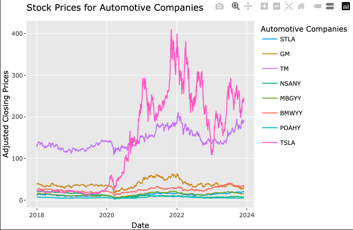
Stock Prices Visualization:
The graph indicates that recently, Tesla (TSLA) experienced a significant surge in stock prices, outperforming other automotive companies. Notably, while Tesla’s prices were initially similar to its competitors, they saw a substantial rise by 2020. Meanwhile, Toyota (TM) maintained consistent high performance since 2018, but Tesla’s stock prices surpassed them as well by 2020.
Since Tesla is a dominant EV manufacturing company this is a significant finding and hugely indicative of the rise in the market share of electric vehicles.
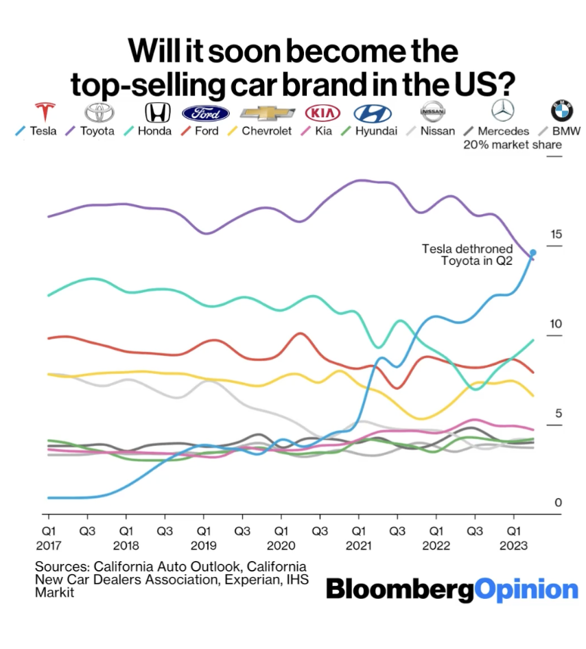
Data from Bloomberg:
Some researching led to this visualization made by Bloomberg highlighting the rise of Tesla in 2020. Not only does it agree to the analysis carried out earlier based on the financial data from Yahoo.com, but it provides a closer look into the exact moment when Toyota was dethroned by Tesla.
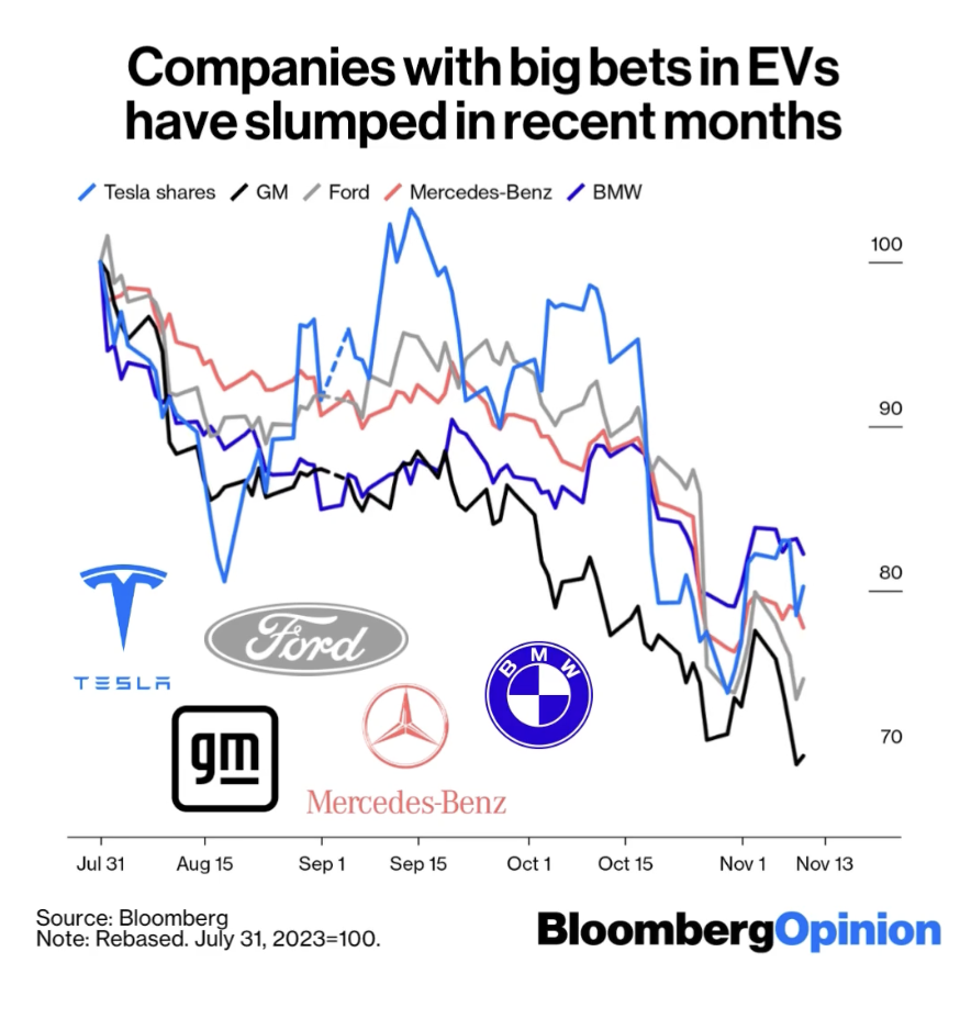
While there is an evident rise in the market share of EVs, it can also be observed in the initial grpah that after the surge in 2020, there was a general downward slope in the stock prices close to 2023. Another visualization from Bloomberg highlighted this trend and published the following visualization:
This insight sheds light on a temporary decline in stock prices of companies investing in EV manufacturing. It also sparks a broader discussion about the industry’s growth, its impacts, and its potential growth in the upcoming years.